 |
| Fresh Lime and vintage grey Rehearsal Dinner Invitations |
 |
| Coordinating Menu and Name cards to complete the evening's dinner |

|
| Fresh Lime and vintage grey Rehearsal Dinner Invitations |
|
| Coordinating Menu and Name cards to complete the evening's dinner |
 |
| This sweet couple has some fun taste! I was excited to design "Day of Details" for them. A cord of three strands was tied at the top of the program. It held a tag with the couples logo. (and on the back a bible verse "A cord of three strands is not easily broken") sweet! |
 |
| Menus for table |
 |
| Water bottle Labels and Escort Cards to carry the theme |

 |
| It's always fun to have signs on the couples reception chairs |
 |
| Navy Blue Classic Stripe Wedding Suite |
 |
| Outer Envelope with Custom Pyrite printer Liner encases the Pocketfold tied with silver cord and couples logo |
 |
| Love Custom Stamps that tie it all together, before you even open the envelope you know it will be special! |
 |
| The pocketfold had a platinum vellum wrap |
 |
| The overview view! |
 |
| The Rsvp card was rich with whimsy and still maintains a classic feel! again can we notice those yummy stamps! |
 |
| "Pat the Bunny" is a classic book we all know and love. So having been "Pintrest Inspired" I grasped the theme of Classic Children's books and ran with it! |
 |
| The inside of the "book" has a more whimsical approach, and holds the "Baby Well Wishes" keepsake for the guests to bring to the shower, for mom to keep. Each guest was asked to bring a Classic Children's book to create a "Lil Library" for the Baby. |
 |
| Had to keep the flavor going on the envelope, so it feels magical before it's even opened.. |
 |
| Loved this card idea as a keepsake for the baby for years to come. Perhaps read on special birthdays. |
 |
Graduation for Two! The challenge was to combine two completely different people and schools. Here is what I came up with. Congratulations Weston and Noelle and to ALL the graduates! |

 |
| Just got back from a fabulous Nashville Wedding. Wanted to share some small details I did. In this photo you can see some personalized "out of town bag " details. Water bottles, Bag Tags, Candy Bar Wraps. |
 |
| Creative Signage makes even Water Fun! |
 |
| Programs that keep the romantic plantation feel. |
 |
| Escort Cards |
 |
| Menus |
 |
| I love receiving a thank you card with a photo of the day. I try to encourage my brides take this opportunity to share a wedding photo their guests may never see. |
 |
| Hoping the invites will make the Birthday Gal feel Cherished! |
 |
| Soft Grey and Pink set the elegant tone I was hoping for. |
 |
| Party Favors for the Guest with a personal touch. |
 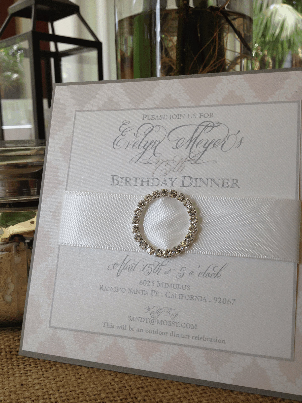 |
| I love a bit of "Classy Bling"I think it makes a simple invite more of a gift to cherish. |
 I love when I'm browsing through the Internet and I find one of my weddings featured! This one was on
  |
| Jennifer is so very cool, and her logo needed to reflect it. She loves the vintage retro look (she looks and dresses the part) so we needed a logo to reflect her business. Here is what I came up with. |
 |
| Taking the Brides beautiful floral pattern from her Wedding Invitations, we carried the theme to the Rehearsal Dinner Invite. |
 |
| The envelope liner was created with the same floral pattern. I think it adds to the lovely "luster metallic" cardstock |
 |
| My new Favorite Font! |
 |
| Well, here is the frosting of details on the cake of one of my favorite wedding themes "Vintage San Diego Wedding Suite" |
 |
| Programs carried the soft vintage feel. |
 |
| I always like to see how my artistic rendering and finished product line up |
 |
| Escort Cards with meal selection |
 |
| Artist rendering of the Menu and table number |
 |
| This yummy menu had a iridescent vellum wrap and a beautiful storm envelopement cardstock backing. The couples guest will have to love these details. |

 |
| Love the elegant table numbers in frames |
 |
| These Tags will be placed on custom candy bars. Nice treat! |

 |
| The fun suitcase has the couples Registry Information |
 |
| many loving hands...hand cut our "pop-up"couple. |

 |
| Love Kim's saweeet' envelope train liner |
  |
 |
 |
The Balboa Park Artwork was from a 1915 Program. I toned down the colors to give it a soft romantic feel. |
 |
| The outer envelope was lined with a metallic Pyrite liner. |
 |
Another custom Stamp design ties the ribbon on this package. |
 |
The Map was backed with the same pyrite color. I love little round maps. |
 |
| Love the custom stamps! |

